The Coffee Table as Editorial Space
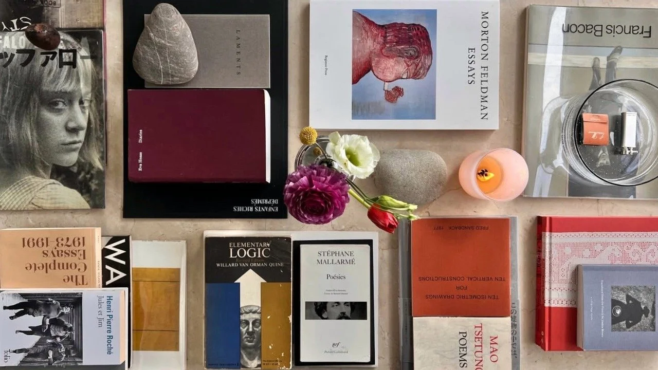
A coffee table isn’t styled—it’s composed. These are the titles that shape a space, interrupt a room, and hold weight without saying a word.
The coffee table is the one surface in a home where culture and composition coexist.
A coded arrangement of objects that reveals what the room is trying to say. It’s the only surface where art, conversation, and culture are expected to overlap. And when it’s done well, it doesn’t just decorate—it declares.
Books as Sculptural Intent
Your coffee table is not the place for filler. Each object on it should carry visual weight. Books, especially, do more than sit—they ground. The best ones are oversized, graphic, and tactile. You want texture, bold type, linen covers, or uncoated pages. Think in layers: height, finish, tone.
The Booklook Method: What to Stack
A strong table stack doesn’t blend in. It interrupts. It asks for a glance, a question, a second pass. These three books from our current collection ground a table with texture, color, and cultural weight.
Juxtapoz Hyperreal
A punch of print energy. This issue brings raw color and contemporary edge, breaking the monotony of neutral spaces and injecting visual friction. It’s the top book in the stack—the one that catches the eye.
Soho New York by Steve Khan
A photographic archive of a city in transformation. Monochrome, elegant, and rhythmically paced—this is the visual equivalent of ambient jazz. Best placed mid-stack, lending depth without distraction.
Mimo: Miami Modern
A grounding piece with soft edges and sharp design. Best placed at the base of the stack—quiet, stable, and distinctly modern. Its design-forward approach makes it ideal as a foundational piece—low, wide, and quietly confident. A grounding book that makes space for everything else.
Design Note
A coffee table isn’t styled by accident. It’s a composition—an editorial moment where form meets mood. Every book on the table should earn its placement, not just by cover design, but by the tension it creates with what surrounds it. Vary scale, rotate textures, leave negative space.
Avoid symmetry. Avoid themes. Choose contrast over coordination.
Let one title be bold. Let another be architectural. Let the last disappear into the table until someone touches it.
This is not about showing off what you’re reading. It’s about building an atmosphere where books are part of the architecture of your life.
The stack says everything.
Books that anchor a space, not just decorate it.
Rick Owens’ Library: A Case Study in Control
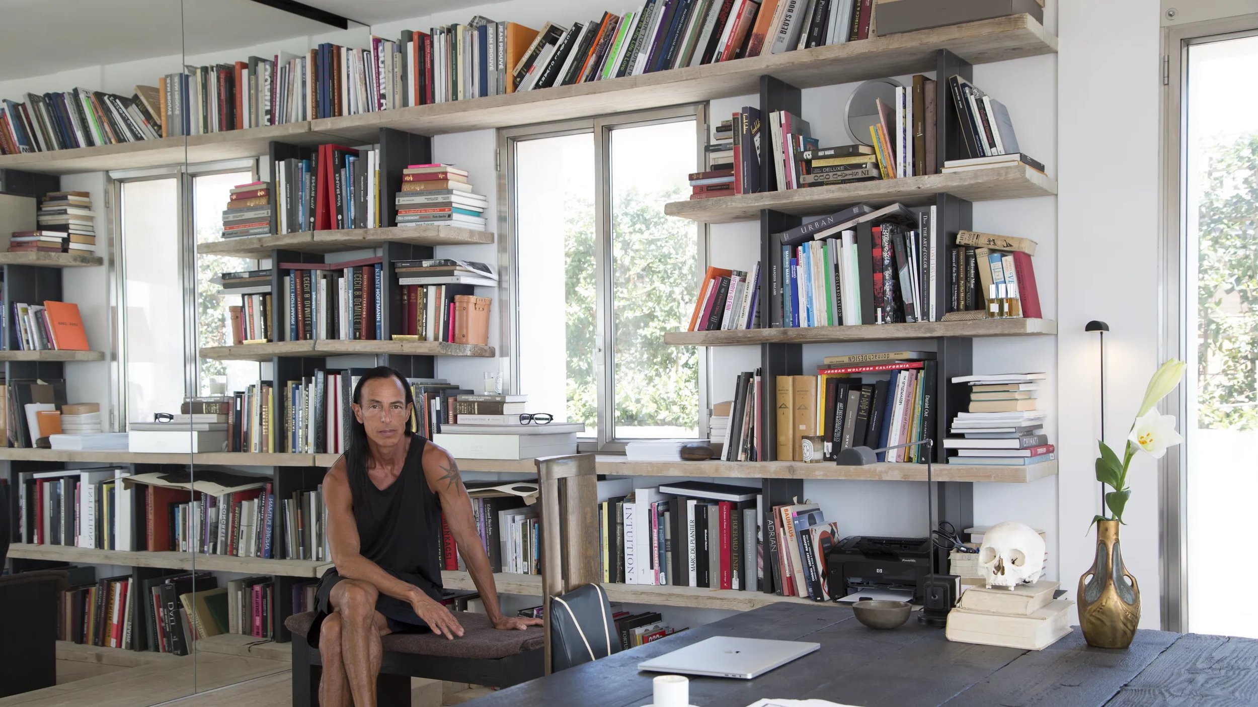
Rick Owens’ Paris library isn’t styled—it’s structured. A monochrome grid of oversized books, collected with discipline and designed to anchor the room. This is what happens when taste becomes architecture.
Courtesy of Jean-Francois Jaussaud for Mr. Porter
A Visual Philosophy
In Rick Owens’ Paris apartment, shelves stretch wall to wall, housing a dense arrangement of oversized volumes. Each book is chosen for its presence as much as its content. Architecture. Brutalism. Sculpture. Religious iconography. Fashion monographs, often stripped of their jackets, bound in matte black or bone-white linen.
This isn’t a casual stack. This is a material language: heavy, architectural, and monastic. The kind of books that alter the acoustics of a room.
What It Signals
This shelf isn’t for show. It’s a system. A worldview.
To walk past it is to understand how Owens thinks—by reduction, opposition, and silence. He’s not just collecting books; he’s reinforcing a space. There’s no color theory here. No balance of highs and lows. Just form, texture, and weight.
Maximalism by way of discipline.
Elegance through refusal.
Design as austerity.
Courtesy of Jean-Francois Jaussaud for Mr. Porter
Inspired by the Stack: The Booklook Edit
While Rick Owens’ collection leans toward architectural theory and monastic design, the deeper thread is clarity of intent. Books are selected not for trend, but for tone—for the ideas they hold and the physicality they bring into a space. These titles from the Booklook library echo that philosophy: bold, material, and uncompromising in form.
Maya Lin: Boundaries
This book explores the intersection of architecture, memory, and land. Much like Owens’ own practice, Lin's work is a study in restraint—elegant, exacting, and built around the tension between presence and absence.
Graphis: Alternative Photography
A visual archive of photographic work that resists convention. The book’s experimental textures, unpolished forms, and subversion of traditional beauty reflect the rawness that defines Owens’ aesthetic world.
Visual Impact: Creative Dissent
in the 21st Century
A collection of political art and graphic protest that shows how visual culture shapes public discourse. It shares Owens’ confrontational edge—designed not to blend in, but to challenge, disrupt, and endure.
The Takeaway
Books can exist as anchors, as visual arguments, as atmosphere. In Owens’ case, they function as architecture—a modular structure within the room. The books aren’t added after the space is designed. They are the design.
For those who think in shape, weight, and shadow: this is the standard.
Courtesy of Jean-Francois Jaussaud for Mr. Porter
Shape your own library.
Collected not for content alone, but for presence, form, and tone.


